The NFL could be entering what might be a golden era for its teams’ uniforms − one of the most visible, marketable and profitable components of the country’s biggest sports juggernaut.
Two years ago, the league reinstated the use of secondary helmet shells, a development that allowed teams to develop alternative uniform combinations and/or embrace their past looks. Think about teams like the Tampa Bay Buccaneers, New England Patriots and Tennessee Titans (aka Houston Oilers), who all featured white helmets with their classic looks – and, yes, you’ll find the 1970s, ‘80s and ‘90s are an especially prized fashion era, especially if that’s when you fell in love with the game – but couldn’t reprise them until the uniform rule was modified.
Now the helmet palette is being expanded further, teams undergoing uniform redesigns this year offered the option to implement a third helmet, an alternative that will be available to every organization in 2025.
Not every club will maximize the rule at first – or maybe ever – but at least we’re off and running with the New York Jets, Detroit Lions, Denver Broncos and Houston Texans all revamping their unis for the 2024 campaign … which naturally necessitates and update to what have become our near-annual NFL uniform power rankings, listed from worst to best (previous rank in parentheses):

32. Washington Commanders (31)
Good luck finding anyone, specifically in the D.C. area, who has much enthusiasm for this completely uninspired, if necessary, rebrand – and that seems to include the new ownership group, which hasn’t exactly dismissed the notion that another one could be coming at some point. The road uniforms in particular are eyesores with the black alternates the best, if somewhat by default … though the use of the District of Columbia flag on the shoulders is a keeper.
NFL DRAFT HUB: Latest NFL Draft mock drafts, news, live picks, grades and analysis.
31. Carolina Panthers (29)
Learned recently that the panther head logo is designed in such a way as to resemble North and South Carolina together on a map. Kinda cool. Not much else about these uniforms is. A dated hodgepodge that just takes you back to the 1990s, when black and teal (or “Panther Blue”) – the San Jose Sharks basically – was hot. Seems like it’s time for an update, maybe with something closer to Carolina Blue. But the logo can now stay.
30. Cleveland Browns (30)
Only a Clevelander can truly love brown mixed with orange, otherwise only seen on the less-appetizing candy corn or Tony Gwynn’s San Diego Padres. Points are further deducted after the team didn’t use its brown-over-brown combo with orange numbers last season. But the Browns are very excited to be going back to their white facemasks – points for acknowledging their relative 1980s greatness – and a glossy orange helmet shell.
29. New England Patriots (19)
If it was time to part ways with Bill Belichick, then it’s time to part ways with the “Flying Elvis” logo and officially put the dynastic era in mothballs in favor of a rebrand … or at least a full-time return to the “Pat Patriot” uniforms.
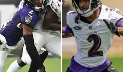
28. Baltimore Ravens (26)
Be nice if black and purple complemented each other a bit better, but when you’re going for Edgar Allan Poe… The purple jersey with the gold numbers does pop, but the AFC North champs didn’t wear it last season. The Maryland flag baked into the shoulder crest remains the best detail. However club president Sashi Brown said earlier this month that, “We have some stuff that’s coming,” in terms of an alternate look. Nice to see the Ravens’ account on X, formerly Twitter, utilize the infamous mustard pants as part of an April Fools’ Day prank.
27. Jacksonville Jaguars (24)
Kind of in a meh spot – not offensive but not inspiring, though that’s certainly a better state of affairs than some of the uniform (and helmet) atrocities they committed a decade ago. Appears the Jags are another franchise that will also be wisely throwing it back this season … at least to the extent you can go retro when you’re not even 30 years old.
26. Arizona Cardinals (25)
Are they effectively Ohio State West since last year’s redesign? Yeah, basically. Is that a notable improvement from where they’d been? Yeah, basically.
25. Atlanta Falcons (27)
Say this for former HC Arthur Smith – at least he embraced the throwbacks and kept those hideous gradient alternates out of sight. (Unrelated, did you know the team has red pants, never worn, squirreled away somewhere in the equipment room?) Since they’re apparently not making the throwbacks their primary uniform any time soon, hopefully they at least bring back the 1980s-era red jersey and silver pants at some point.
24. Denver Broncos (32)

They rolled out their updated “Mile High Collection” on Monday. Is it an improvement? Sure … though looking worse would have been a challenge. The swooshes are gone from the side panels and pants and the tapered stripe removed from the helmet. In their place are a bunch of triangular “summit markers” on the jersey and back of helmet and a few “5280” references … just in case you’d forgotten the Broncos play in the shadow of the Rocky Mountains at a mile above sea level. (Unrelated, they also made extensive use of an orange Ford Bronco in their social media rollout … which only made me wonder if they aspire to be the Lions and are paying royalties to Ford.)
In fairness, a lot of exhaustive work and focus grouping goes into these redesigns. It’s just hard not to get snarky when the final product looks like the lovechild of the Chargers’ uniforms and the University of Virginia’s – especially when the (correct) path of least resistance was to make the John Elway-era classics (when the Broncos could not win a Super Bowl) the main ones once again. But let’s at least give Denver points for utilizing all three of its helmet options – the “Midnight Navy” primary, “Summit White” alternate and the iconic throwback. TBD if new QB Zach Wilson can complete half his passes in any of them …
23. Tennessee Titans (28)
They’re a bit of a mess with various color splashes and combinations and the shoulder and hip detailing callbacks to a Roman centurion, which is both creative and inelegant. But you can forgive a lot when the Oilers throwbacks are back in the rotation – they returned in their full Columbia Blue glory in 2023 – much as Houstonians understandably hate seeing them.
22. Los Angeles Rams (20)
With the exception of the yellow-white gradient on the blue jersey’s numbers and blue pants’ striping … it’s kinda grown on us holistically, even the increasingly (and correctly) minimized “Bone” roadies. But things would be a whole lot better with some throwbacks mixed in – preferably navy jerseys and helmets with white ram horns.
21. Chicago Bears (23)
Conservative classics that feature perhaps the league’s best sock game. The throwbacks go way back, the helmet similar to the University of Michigan’s. If they didn’t wear the orange helmet and orange jersey combo again, would anyone complain?
20. Miami Dolphins (15)
The unique aqua and orange color scheme is an appropriate homage to South Florida, and the new logo has aged decently – though, like their AFC East brethren, the Fins’ throwbacks remain the superior look.
19. New York Giants (17)
They should take a cue from the Jets – imagine that, New Yorkers – and revert to their late-20th century uniforms permanently or, at minimum, make those their primaries. Befuddling that, aside from the helmet, “Big Blue” currently has zero blue in its main roadies.
18. Detroit Lions (22)
It’s nice to see a team owned by the Ford family continue to weave the Mustang motif into its uniforms with this year’s new striping pattern. The blue collar featured in all the jerseys is also a nifty way to honor the hard-working folks of Motown. But slick as the new alternate blue helmet is, not as sweet as the one used last season with the creeping lion logo – which, sadly, is no longer in the closet.
17. Buffalo Bills (16)
Clean presentation and can’t argue with the charging buffalo logo, though we’d like to see the grazing version from the team’s AFL days mixed in with a bit more regularity … maybe with an alternate blue helmet?
16. San Francisco 49ers (14)
Solid if understated, which is pretty much how the Niners’ “Faithful” want it. Must be noted that history has shown an interlocking SF just can’t beat an interlocking KC when it counts.
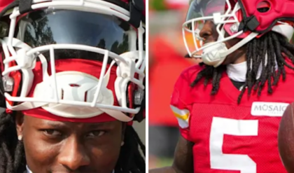
15. Kansas City Chiefs (11)
Their classic, simple look is increasingly familiar – just ask the Swifties. And the arrowhead KC logo is also becoming synonymous with excellence and dominance. But a little variety would be nice, the champs the only team that doesn’t employ a third jersey and stubbornly disinterested in expanding their wardrobe.
14. Houston Texans (18)
They vowed to unveil the “most fan-inclusive and transparent uniform redesign in NFL history.” It’s possible they fully delivered on that front Tuesday. While largely keeping their classic look intact, the Texans actually did seem to widely implement what they learned from more than 10,000 surveys and 30 focus groups – creating a civically inspired Color Rush uniform and helmet and an alternate red kid and helmet that really pops with its “candy paint red flakes” and chrome facemask. Really a diverse collection anchored by the team’s tradition while nicely leveraging the league’s new rules to incorporate freshness and variation. Other teams would probably be wise to follow suit.
13. Dallas Cowboys (12)
Love or hate “America’s Team,” the Cowboys’ brand, star sigil and all, might be the most recognizable in team sports. The long-standing tradition of wearing white at home has always given their fans a different color visual to enjoy every week since the visitors usually wear their home unis – even if you believe, like I do, that Dallas actually looks better in its navy jerseys and silver pants.
12. Indianapolis Colts (10)
They just exude NFL history – Johnny Unitas and the iconic horseshoe logo made my father an NFL fan, and the primary uniforms haven’t evolved all that much over the decades. The “Indiana Nights” alternate was a generally nice addition to the collective locker last year, though the black helmet was an unnecessary whiff.
11. Green Bay Packers (13)
They exude even more NFL history for the league’s all-time winningest franchise. However, it’s probably time to have a little fun with the monochrome dark green alternates by adding a green helmet.
10. New York Jets (21)
First – thank you. And OK, fine – apparently, we’ll never get anything that incorporates the silhouette of an F-22 or evokes imagery of Maverick Mitchell shooting down fifth-generation “Soviet” fighters (or Patriots). But the permanent callback to the NYJ’s 1980s look is nevertheless a significant Mach 2.5 leap forward. The uniforms are gorgeous, the logo is sleek – both on the shimmery green helmet and black matte alternates – and the new secondary insignias provide some needed variety. The opportunity cost of a truly unique third kit remains the only major complaint here … though the players don’t seem to have any.
9. Minnesota Vikings (8)
Long underrated with their popping purple and gold combination and the subtle Norse details on the current uniforms. The throwbacks are clean but a shame the alternate purple jerseys with gold numbers remained in storage last season.
8. Cincinnati Bengals (7)
No better head-to-toe alternate in the league than the white tiger kit topped with the bleached helmet and black tiger stripes. They’ve also nicely toned down their primary uniforms, which remains one of the league’s more creative, fun looks. Wouldn’t complain if they punted entirely on the orange jerseys – though they effectively have, donning them just once last season.
7. Tampa Bay Buccaneers (9)
The “Creamsicle” uniforms are back in the lineup, and the alarm clock jerseys remain a thing of the past. (And we’re totally fine with the Sapp- and/or Brady-era pirate ship kits being the usual look with “Bucco Bruce” mixed in occasionally.) Said another way, all is right in the world of NFL haberdashery … at least as it pertains to Florida’s Gulf Coast.
6. Philadelphia Eagles (6)
How great was it to see the return of the Kelly Green retros in 2023? While looking forward to seeing them more often … the Midnight Green and black might be a bit underrated, while also eternal as the only uniform in which Philly’s won a Super Bowl.

5. Seattle Seahawks (5)
How great was it to see the return of their original blue, silver and green look in 2023? While looking forward to seeing those retros more often … for my money, the College Navy, Wolf Grey and Action Green contemporary look – with the creatively incorporated feathers, some tapering over the top of the crown – is Nike’s best redesign, while also eternal as the only uniform in which Seattle’s won a Super Bowl.
4. New Orleans Saints (4)
As a general rule, too many uniform combinations tend to diminish a team’s identity and brand. Not here. Black, white, “Old Gold” – it all works, including the deeper hue of gold used on the home and away throwbacks. The black helmet with the cascading Fleur-De-Lis logos down the centerline is arguably the league’s best alternate shell. But wouldn’t it be great if they could do a Mardi Gras-inspired version, basically a Saints-themed uniform with New Orleans Jazz colors?
3. Pittsburgh Steelers (3)
Black. Gold. The iconic logo evoking the Steelmark symbol used by the American Iron and Steel Institute with the trio of hypocycloids on the right side of the helmet. A true classic … even if some of us like the “Dark Knight” alternates even more.
T1. Las Vegas Raiders (1), Los Angeles Chargers (2)
A clear copout, but sometimes there’s no favorite or wrong answer. The Bolts offer a sun splash of color, multiple uniform combinations – though not so many to muddle their look – and the lightning logo that so perfectly spans the helmets. Conversely, the Silver and Black feature the league’s most menacing look, courtesy of their color scheme and sinister shield logo.
Maybe the tiebreaker will eventually go to the team that comes up with the best uni tied to a secondary helmet? Sure would like to see the Chargers in the Seau-Tomlinson era navy lids with the white bolts. And sure would like to see the Raiders in monochrome black, topped with a now authorized black helm and the primary logo in silver. The Jets finally listened to me – no reason the AFC West’s best-looking clubs shouldn’t.
